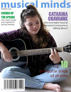
a. What is the name of the magazine that you looked at and who made it?
This is 'Musical Minds' by Sophie W.
b. List two things you liked about the magazine cover
I like the lighting of the photo, and the colors and typeface. I also like the usage of postive and negative space when placing the cover lines.
c. Suggest something to the creator to improve the cover
You could try using less colors in the text, and instead pick two or three that go together with the photo.
d. Why did you pick this cover? Specifically what attracted your eyes.
I picked this cover because it filled the space nicely and the quick mask technique used to place the text behind the subject looked professional.
e. Is there a bar code? Is it appropriate in size and located in the correct place?
I feel like the bar code's a little too big, but it's in the right place.
I feel like the bar code's a little too big, but it's in the right place.
f. If you were walking by the magazines in Barnes and Nobles would you pick this magazine up and look at it? Why or Why not?
Yes, it looks professional and interesting. The cover lines help to explain more about the magazine's theme.
g. Can you tell if it was a portrait or self-portrait?
It could be either, I think it's a portrait.

a. What is the name of the magazine that you looked at and who made it?
The name of this magazine is "Iridescence", it's by Emily Merritt.
The name of this magazine is "Iridescence", it's by Emily Merritt.
b. List two things you liked about the magazine cover
I like the font choice, effects, and limited color palette.
c. Suggest something to the creator to improve the cover
The photo is low-resolution, getting a closer shot and spacing out the cover lines more could help. The price should be closer to the bar code and not precede the first cover line.
d. Why did you pick this cover? Specifically what attracted your eyes.
I like the aesthetic appeal, which draws the viewer in to read the cover line content.
e. Is there a bar code? Is it appropriate in size and located in the correct place?
The bar code is located and sized appropriately.
f. If you were walking by the magazines in Barnes and Nobles would you pick this magazine up and look at it? Why or Why not?
I would look at this magazine, it looks conceptual and interesting to read through.g. Can you tell if it was a portrait or self-portrait?
Portrait?

a. What is the name of the magazine that you looked at and who made it?
This magazine is called "Stress" and it's by Jaye R.
b. List two things you liked about the magazine cover
I like the subject and the limited color palette on the text. I also like the quick masking technique used on the title text.
c. Suggest something to the creator to improve the cover
The typefaces clash a little bit. Using another sans-serif font for the title would help.
d. Why did you pick this cover? Specifically what attracted your eyes.
It seemed to have a centralized theme and the subject matter was interesting and made me wonder about the contents.
e. Is there a bar code? Is it appropriate in size and located in the correct place?
The bar code is in the right place and is the right size.
f. If you were walking by the magazines in Barnes and Nobles would you pick this magazine up and look at it? Why or Why not?
Yes, I would be interested in the magazine's contents based on the cover.
g. Can you tell if it was a portrait or self-portrait?
This was a portrait.
No comments:
Post a Comment